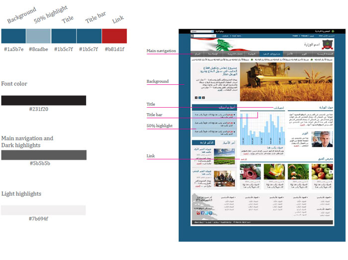
Color should be used on a page to provide differentiation between information and to code individual government entities. The next slides show multiple color combinations which have been developed to meet with
accessibility requirements - Others may be used but should follow the below principles.
The use of color
- Most pages will only need to use two colors from the shown color range along with the supporting gray. A third color can be used if extra differentiation is needed but avoid making pages feel too multicolored
- In most cases the background color dictates the main navigation drop-down color
- The horizontal title bars should go with the chosen background color (unless too light)
- Headings and titles should (where possible) use a darker shade of the main color
- Links and buttons should use a secondary color that is contrasting enough with the main color to ensure differentiation of functionality
- The highlights columns could be 50% lighter than the main color chosen or simply gray so that it is neutral and works with all colors
- Consider legibility when placing text over solid colors. Use black or darker colored type on the lighter tints
